
Challenging the safety of conformity: Better poster design to disseminate scientific knowledge fast
“Congratulations – your abstract was accepted for the upcoming EHA congress”. Receiving an abstract acceptance notification not only means that it is time to arrange your trip to the conference, but also that you need to think about your presentation. To help you prepare the best poster you have ever presented, for EHA24 and other conferences in the future, YoungEHA has spoken to Mike Morrison, a Graduate Student in Organizational Psychology at Michigan State University in the U.S., and the founder of the #betterposter movement. Mike is proposing a jarringly different scientific poster design, where your take-home message takes center stage and the wall of text is broken up into 3 columns to filter out cognitive noise.
Fabienne: Mike, thank you so much for talking to us! Since you posted your video tutorial on how to prepare a better scientific poster at the end of March earlier this year: https://www.youtube.com/watch?v=1RwJbhkCA58 you have become widely known as “the poster guy”. Tell us about who you are and what you did before you embarked on the #BetterPoster movement.
Mike: Sure! Before becoming “poster guy,” I was a web developer/user experience (UX) designer for 10 years, then I quit my software career and started a PhD in organizational ‘work’ psychology. I study things that make work meaningful, and the difference between realists and dreamers. During my first few years of grad school, I nearly went insane from how bad the user experiences of science were - wall of text posters, pointless publishing delays, scanned PDF files, just to name a few examples. The #betterposter movement, to me, is an opening salvo in what I hope will be a much larger effort to improve the user experiences of science, so that we can distribute and consume it much faster and more efficiently.
I study things that make work meaningful, and the difference between realists and dreamers.
Fabienne: What exactly inspired you to start thinking about a better way to present a scientific poster?
Mike: My own health scare a couple years ago made me realize how many people are out there suffering and waiting on science to rescue them. It really lit a fire under me to try to make the dissemination system of science more efficient to speed up cures for diseases, even by a little tiny bit (working on this problem is like my coping mechanism at this point). I’m very personally invested in improving the rate of discovery across many different fields. As for the poster, it’s something that I could take a swing at on my own. There are much more damaging bottlenecks, like the scientific article publishing system, peer review inefficiencies, etc. But those will take teams of well-funded people to fix. The poster was the lowest-hanging fruit.
Fabienne: I vividly remember my first scientific poster presentation at a large international conference - a huge hall, thousands of people I did not know yet desperately wanted to impress. Finally, one very distinguished looking guy stopped at my poster, stared at it, shook his head, burrowed his face in his hand and walked away. Would you say this was a rare encounter, or do situations like this happen more often than we think?
Mike: Damn that’s super harsh! But who knows what he was responding to. As I’m sure you did that day, our tendency when we have a bad experience presenting a poster is to project-in all of our insecurities: I must have done something wrong, my research isn’t interesting enough, my poster sucks. As a presenter, you want to see the impact of your work. It is so, so terribly common for poster presenters to not get ANY sense of feedback from their poster. And research on work meaningfulness shows that this feeling of investing yourself in something that just falls dead, not even a success or failure, is the quickest way to make your work feel meaningless.
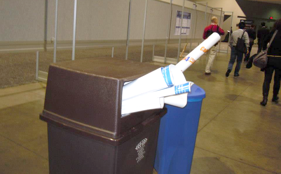
And it’s even worse for attendees: They just want to learn, but are overwhelmed by these walls of text that are so overloading that nobody reads them at all. So you can only learn maybe like 2 out of 50 posters per session. That’s 48 stories that you’re straight missing, and so many missed opportunities to network, gain insight and brainstorm. Coming back to your experience, Fabienne, maybe this happened because our entire approach to posters is wrong.
Fabienne: How so?
Mike: Think of driving by billboards on a highway in the US. What’s on a billboard? An interesting picture and a short slogan, right? Because that’s all you have time to read while driving by! Imagine if advertisers tried to put several paragraphs of text onto a billboard. You’d be able to notice a couple words maybe, but the rest would turn into noise. That’s how we’re designing scientific posters right now, in hematology and everywhere else: We’re trying to put our paper on something that is effectively walked past like a billboard. As a result, most of our work turns into scientific noise!
Fabienne: Do you think there was ever a time when traditional poster designs worked?
Mike: I think the traditional design works perfectly well when you’re going to spend a lot of time reading a poster up close, and treat it like reading a paper. And maybe that’s how we got the traditional design; maybe the first poster sessions were leave-up sessions, and we just never rethought them when we started doing 1-hour sessions with 50 posters each.
Fabienne: So how do you make a better poster?
Mike: Think of how you would design a poster if you were trying to show that you did a lot of work: put EVERYTHING you did on it, cover every detail, not leave any space blank. Now think about how you’d design a poster if you were trying to teach somebody something. You’d focus on just communicating a few core things in simple language. Design your poster like you’re trying to teach people your finding as they walk past, from a distance. You have 5-10 seconds at 3 feet. That’s it. You’ve gotta punch your main finding into their brain. If you can do that, you’ve won the game - and the game is to disseminate scientific knowledge. So it’s kind of an important game.
Fabienne: Is there a scientific rationale to your approach?
Mike: Yes! Research on academic posters suggest that nobody reads the traditional scientific posters. People just skim a couple words from the title and maybe glance at a picture. As for the big ‘plain English’ finding: usability studies have shown that ‘plain English’ is interpreted faster and sustains attention better than formal writing styles. Because plain English is how people think. The layout of the #betterposter itself is based on tried-and-true UX design principles: grouping related information and using negative space to help people find signal in the noise. But most of all, it follows the most sacred user experience design principle of all: Design for how the thing is used, not just to make it pretty.
Fabienne: Your approach has been featured in the NEJM journal watch blog and the Nature Briefing Newsletter, and your video is linked on several other websites as a tutorial for poster education. So the #betterposter movement has clearly gone “viral”. Tell us about the feedback you have gotten and how people have reacted to your suggestions.
Mike: I’ve gotten SO much great feedback from every corner of the scientific community. Most people who’ve tried the #betterposter design at conferences have had stunningly positive experiences, resulting in “the best poster session of their life”. And nearly all report that they got more attention and better conversations. I think we’re also up to 5 or 6 people who’ve even won poster awards!
Fabienne: Have you been working on improvements of the first version?
Mike: Absolutely! The first version is pretty clearly more effective than the traditional ‘wall of text’ at this point for most people. But there’s still lots of room for improving it, especially when it comes to special features that certain fields need. Also people have tried all kinds of variations to test new features and modifications. And some have suggested specific tweaks. Doctor Zen Faulkes, who’s been learning about how to make effective posters for years through his Better Posters blog, suggested some great improvements to the design (some of which I’ve already incorporated into the template).
Some people are blindly negative towards it, of course, but those people have been much fewer in number than I expected. I’m treating it like a new software product. I release an updated version of the template about once a week with new examples and things to try, and I’ll keep revising it as people test and figure out what works best for different use cases.
Fabienne: In the past there have been other attempts to change the way scientific posters are prepared. What gives your approach more impact and makes it more sustainable?
Mike: Honestly, I think the most compelling feature of the #betterposter layout is that it is the easiest and the most fun to create. It’s 3 colored columns. Kids can use it. But if you want to apply your creativity and artistic side, you can scale that up infinitely to great effect.
It also focuses your poster creation time on the right concerns. Grad students shouldn’t be spending 2 hours fussing with arranging stuff on their poster. In #betterposter, the basic layout is largely done for you. So you can put your time into writing your punchline/takeaway sentence, into making your sidebar-summary extra skimmable, or adding a little creative graphic flair to reinforce the topic/finding of your study. That’s the fun stuff for you, and it’s also the stuff that makes the biggest positive impact on attendees. So in true UX designer fashion, #betterposter isn’t just user-friendly to read; it’s user-friendly to create. Plus the free & open access template files make it even faster for you to use it instead of hacking together a new design from scratch.
Fabienne: Do you think there is a caveat to the better poster movement? I.e. in the wrong audience, is there a chance that findings are oversimplified, facts are overstated, or interpretations are misleading?
Mike: This question keeps me up nights! I think there are indeed lots of caveats. But first, realize that a lot of them can be addressed by how well people write their takeaway sentence – neither too simplistic nor too overstating. But really, what is more damaging to science? Attendees remembering an oversimplified version of your main finding, or totally missing your research?
Fabienne: The better poster design is clearly breaking with convention and it requires courage to be “the one who does things differently”. How do you encourage people to “come-of-the-old-poster-box”?
Mike: First, watch the video. I created the video specifically because the design is jarring when you first see it. And happily, the video seems to persuade people as intended. Second, ask them how many posters they typically absorb in a session. Ask them if they miss the majority, because they probably do. Ask them why they can’t read all the posters (answer: Because it takes too long). Ask them how confident they are that nothing on any of the other posters could have helped them in their science. Now ask them if they think poster sessions could be more efficient at knowledge transfer. So even if they hate my design, how can you reduce the cognitive load of your poster, so that it’s easier to interact with in less time? How will you help people find more signal in the noise?
Fabienne: Let’s take it one step further: you as the PI are truly convinced by the #betterposter approach. How do you use your influence to change the way scientific posters are prepared and presented on a larger level?
Mike: First, do not force it on anybody. Be enthusiastic about it, give people the option of using #betterposter, but if you try to mandate it they may resent having their creative freedom taken away. Share the cartoon and template file and let them know that you’d love them to try it if they want to, but to also feel free to use the old format. But maybe note that the new design is easier to create than the old format… Also, share with your fellow faculty. For example, the entire organizational psychology department at Rice University (a top program in my field of Organizational Psychology) just made a group decision to use #betterposter at our last conference. It was amazing, and I will love them forever for being such courageous pioneers. But keep in mind; it’s very scary to try something new for the first time. The SLIGHTEST negative implication can make people scurry back into the safety of conformity.
Fabienne: Do you think that this will work in all fields of science?
Mike: At minimum, every field of science needs to figure out how to design posters that teach attendees the main takeaway of the study in 5-10 seconds while they are walking past the poster from 3 feet away. That’s the realistic user context. But fields may differ in what they need to show to communicate what they found (and ideally, how they found it). One field may need to show pictures of molecules, another of robots, another of weather models, many others may just need a sentence. I really encourage you to experiment and try things, but with the constraint that you cannot break the “10 seconds at 3 feet” rule.
Fabienne: What can #betterposter design achieve in hematology?
Mike: I want you to think of the biggest goals of hematology as a field: Like, what you’re all working towards. The part of the world that you’re trying to fix. Now imagine being able to accomplish that much sooner than you could before. That’s the best case here: Accelerating knowledge dissemination (and thus discovery) across the entire field of hematology.
Fabienne: How do you think an early career researcher in hematology will benefit from a #betterposter design?
Mike: Practical answer: Based on early reports, you will likely meet more people, get more positive attention, and have better conversations with a #betterposter. That means more new research friends to potentially collaborate with, more constructive improvements to your research, more new ideas.
Psychological answer: It’s funny; if you were an ‘early career’ person in the tech industry I come from, you’d be the young hip person with all the fresh new ideas, and everybody would pay more attention to your ideas than the old guard’s. But in science it’s the opposite, you’re the little insecure baby scientist who doesn’t want to do anything wrong, and everybody pressures you to conform. You have to break free from that conformity gravitation in yourself early. Try something new, and let your creativity fully out, before it’s too late and you get sucked into all the traditional approaches. You might be pleasantly surprised. And one of the best things that can happen to you in your early career is to have your rebellious creativity get hugely rewarded.